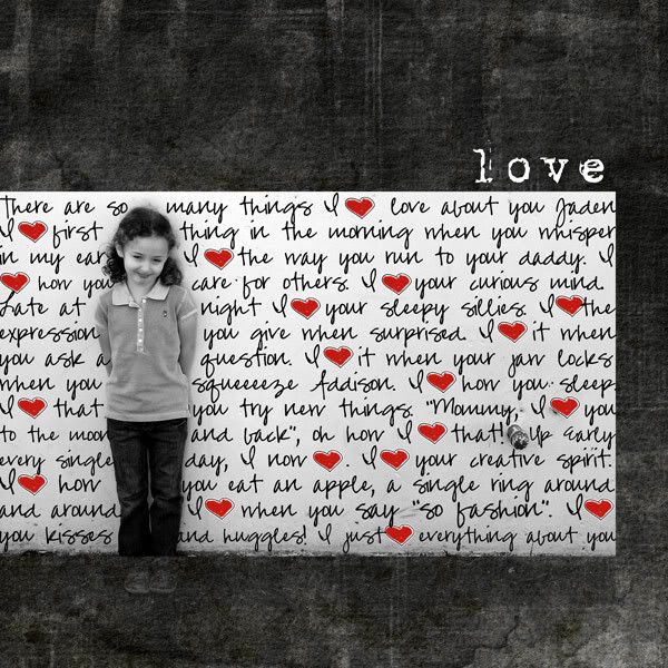
** the following are in black and white for printing purposes**
Before we moved here I asked Taylor if I could create the postcard announcing the event for Jonathan's arrival. This is what I came up with:
When the youth department first came up with the idea of Solid Ground this was the first draft my my logo, Taylor ran with it! :)
Tuesday, September 11, 2007
Youth Department
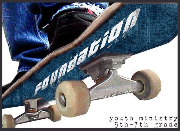
I was asked by Lindsey and Jonathan from the youth department to create graphics for their ministries.
Lindsey wanted "foundation" on the bottom of a shoe print with some kids in baggy/current style clothing. I offered her this graphic keeping in mind she wanted this view point, using the color blue, keeping in line with retro moden ideals.
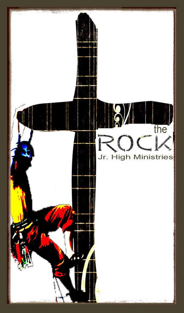
The Rock
Jonathan asked me to create a graphic as well. He didnt have to many requests other then to use the "nail" font you see below. My idea was to keep in line with the Foundation logo, skateboarding, extreme sports. What better to go with that flow of thinking then ROCK climbing. I love the symbolisim this ended up having.
Explore and Discover Series
These are some pictures I edited for a series of events called explore and discover.
Scrapbooking Designs
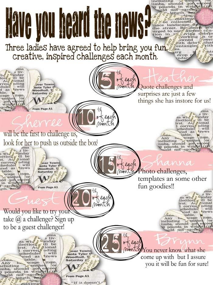
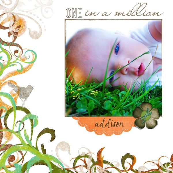
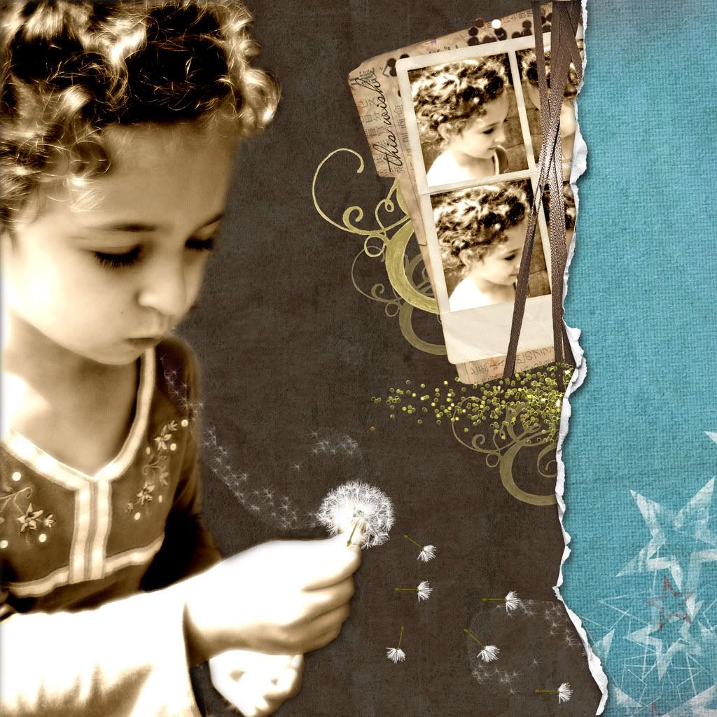
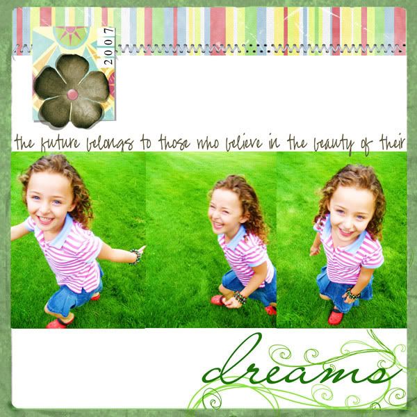
Currently I am on 4 creative teams for online stores providing digital elements. Here are some of the layouts I have created for them.
Blog header
Blog header
Subscribe to:
Posts (Atom)